Peeple is back and now available to download, that is if you want to bother with this watered down version. Gizmodo is appalled, saying "(i)t still sucks" and "it's still awful". Gone is the star system (or is it? PC Magazine continues to describe using stars to rate someone) and in it place is more control over what reviews appear on your profile by allowing users to hide any reviews they choose.
CNET said "is it even a good idea?" and that "it's also terrifying" and yet accepted a review from co-creator Julia Cordray remarking, "I have to admit, that's a review I won't mind sharing," and yet the author remains uncredited.
CBS News choose to include social media comments and Tweets in its story while glossing over the "Truth License", a future monetizing effort that will let users, for a fee, a view of all reviews, hidden or not.
TechCrunch took a negative stance against the app, troubled by the language of the terms:
" 'Once Content is published it may not be able to be removed,' and that by joining, 'you hereby irrevocably grant to Peeple the continuous, non-exclusive, royalty-free right to use your Content for any purpose whatsoever and in any format. These rights shall be assignable, transferable, and licensable by Peeple.'
Um, no?"
They also took the app to task for its reactive stance toward abuse (like much of social media). They even declined to try out the app due to two conditions: the terms of the app (as stated above) and, because it requires a Facebook account, creating a fake account just to test it would break the terms for using Facebook.
Since only users can create a profile, reviews can only be posted with the cooperation of the reviewed. If the reviewed does not have a profile, the reviewer can send an invitation to join so that the review can be posted (or at least be seen by someone).
My suggestion is to not accept these invitations nor to even download the app in the first place.
Because no one wants to see reviews from the social media lonelies.
Tuesday, March 8, 2016
Tuesday, August 18, 2015
Facebook updates two features I never use (and Google updates one).
Facebook just announced updates to its Notes feature (yup, buried away somewhere you have it). In an attempt to get more people to stop using outside blogging sites like Medium, which require you to click off Facebook to view, they have "refreshed" Notes to look exactly like Medium.
Additionally, they are revising the Events feature so that you can more easily cull through your 572 "friends" to invite them to your next housewarming or birthday. Or, conversely, you will be sure to be notified that you are invited to your out-of-state old high school acquaintence's Eagle's tribute band concert. Yay.
Google has updated its Hangouts app/site because they know how much people hate using the telephone part of their mobile telephones.
Friday, May 29, 2015
YIPPEE! Facebook now supports GIFs or yipes, Facebook now supports GIFs
Facebook has finally added support for sharing GIFs. However, it is actually a link from another site that you are sharing. Business Insider has the how-to on the what to do. Over at Techcrunch they get all into testing out the functionality. Seems pages are left in the dust on this update.
Gizmodo, though, has the right frame of mind:
I get to post GIFs!
Oh wait, everyone in my news feed get to post GIFs.
Nooooooooo!
Gizmodo, though, has the right frame of mind:
I get to post GIFs!
Oh wait, everyone in my news feed get to post GIFs.
Nooooooooo!
Thursday, November 13, 2014
Disqus Lays an Egg: Their New Update Is Rotten
Disqus dumped a new update on users today. This finalizes an update initially made in July. That update allowed users to revert back to the previous version. This new update removes that choice and puts all users on the same site format.
And what a horrible format it is.
Your Home page now is divided in to two choices: communities and people. If you have not previously added any, they suggest some of each (and if you have read any of my older posts here, you know exactly how I feel about these kind of "recommendations").
As I actually use this service on a semi-regular basis, only half of the suggested communities were entirely irrelevant. But the others weren't much better. While I have read specific articles from those publishers, I only view their sites via Google News filters and then only if the story interests me.
The people were absolutely no one I had ever heard of before now and will never hear about again.
To find your comments, you must then click on your unlabeled avatar. Next to that is the unlabeled replies and notifications button (moving your cursor over the avatar reveals a hidden label, "Me" while gray or red word bubble reveals "Replies & Notifications". I had to read a guide to the new layout to find them).
Upon reaching your "Profile" page, you will find three buttons: Recent Activity, Comments and Favorites. I don't "favorite" any comments, so they and your comments will be intermixed. But comments are displayed in a new card format that looks like Google's Now cards. Your comment/s on the left and a large image (if available) on the right. Longer comments will be collapsed with a "more" button beneath. The articles are listed in order of most recent comment made. So if you made multiple comments/replies over several days, the most recent brings it up on your list. This is because all of your comments/replies are grouped together on the same card. Replies appear without the original comments that you replied to, just your out-of-context replies stacked on top of each other.
You will find those comments when you click through the Replies & Notifications button. Two buttons are shown, Most Recent and Replies. Most Recent shows only the first line of your comment with a button to "View Comment". This column also shows upvotes (and presumably downvotes) with the user (or guest) and an up pointing carat. These can be hidden by clicking on the gear on the left and checking the "Hide upvotes" box. Replies have a right pointing arrow and are also collapsed with a "more" button if lengthy.
On all pages, to the left of your avatar/replies etc. buttons are a nine-dotted square and a gear. The gear is your usual settings. the square is a "Discover" button for finding "Channels" and topics (publishers that use Disqus).
The Channel buttons did not work, but the topics take you to what is essentially an aggregate of articles/posts that fall under that topic listed in reverse time order (newest at the top). I frankly don't care if Disqus is used for the comments or not. I comment wherever it is easy to create an account.
Disqus allows you to create a profile, anonymous if you want, with few steps involved (or so it was when I joined; they may have one of those mandatory "choose to follow" style set-ups now). Once you have a profile, it is easy to comment by simply clicking on the login button and choosing Disqus. Your posting name will appear in the gray box and you can begin you comments.
I like Disqus, but this new layout is poorly done, though attractive. But pretty does mean useful. Since the earlier update in July, the Alexa ranking was increasing until a peak in September and has now dropped of considerably.
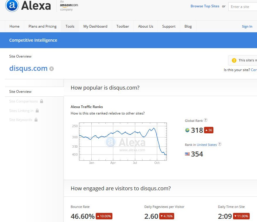
If the feedback on the "Discuss Disqus" channel is any indication, it may continue to drop even more just as they are starting introduce programatic "Sponsored Comments". "This is disappointing and disheartening, especially since my plan is to use comments as a means to connect and build relationships. Now there will be sponsored ads in the comment section–ugh." This comment was later deleted from the blog posting. Allvoices is skeptical about these ads while Adweek at least notes that they use Disqus for their commenting section. Businesswire simply post their press release.
I use adblockers, so I have no fear of these intrusive commercials. My greater concern is that this coupled with a disruptive and counter-intuitive site will cause users to flee what been (up to now) a really useful place to keep track of a lot of your comments without clogging up your email.
And what a horrible format it is.
Your Home page now is divided in to two choices: communities and people. If you have not previously added any, they suggest some of each (and if you have read any of my older posts here, you know exactly how I feel about these kind of "recommendations").
As I actually use this service on a semi-regular basis, only half of the suggested communities were entirely irrelevant. But the others weren't much better. While I have read specific articles from those publishers, I only view their sites via Google News filters and then only if the story interests me.
The people were absolutely no one I had ever heard of before now and will never hear about again.
To find your comments, you must then click on your unlabeled avatar. Next to that is the unlabeled replies and notifications button (moving your cursor over the avatar reveals a hidden label, "Me" while gray or red word bubble reveals "Replies & Notifications". I had to read a guide to the new layout to find them).
Upon reaching your "Profile" page, you will find three buttons: Recent Activity, Comments and Favorites. I don't "favorite" any comments, so they and your comments will be intermixed. But comments are displayed in a new card format that looks like Google's Now cards. Your comment/s on the left and a large image (if available) on the right. Longer comments will be collapsed with a "more" button beneath. The articles are listed in order of most recent comment made. So if you made multiple comments/replies over several days, the most recent brings it up on your list. This is because all of your comments/replies are grouped together on the same card. Replies appear without the original comments that you replied to, just your out-of-context replies stacked on top of each other.
You will find those comments when you click through the Replies & Notifications button. Two buttons are shown, Most Recent and Replies. Most Recent shows only the first line of your comment with a button to "View Comment". This column also shows upvotes (and presumably downvotes) with the user (or guest) and an up pointing carat. These can be hidden by clicking on the gear on the left and checking the "Hide upvotes" box. Replies have a right pointing arrow and are also collapsed with a "more" button if lengthy.
On all pages, to the left of your avatar/replies etc. buttons are a nine-dotted square and a gear. The gear is your usual settings. the square is a "Discover" button for finding "Channels" and topics (publishers that use Disqus).
The Channel buttons did not work, but the topics take you to what is essentially an aggregate of articles/posts that fall under that topic listed in reverse time order (newest at the top). I frankly don't care if Disqus is used for the comments or not. I comment wherever it is easy to create an account.
Disqus allows you to create a profile, anonymous if you want, with few steps involved (or so it was when I joined; they may have one of those mandatory "choose to follow" style set-ups now). Once you have a profile, it is easy to comment by simply clicking on the login button and choosing Disqus. Your posting name will appear in the gray box and you can begin you comments.
I like Disqus, but this new layout is poorly done, though attractive. But pretty does mean useful. Since the earlier update in July, the Alexa ranking was increasing until a peak in September and has now dropped of considerably.
If the feedback on the "Discuss Disqus" channel is any indication, it may continue to drop even more just as they are starting introduce programatic "Sponsored Comments". "This is disappointing and disheartening, especially since my plan is to use comments as a means to connect and build relationships. Now there will be sponsored ads in the comment section–ugh." This comment was later deleted from the blog posting. Allvoices is skeptical about these ads while Adweek at least notes that they use Disqus for their commenting section. Businesswire simply post their press release.
I use adblockers, so I have no fear of these intrusive commercials. My greater concern is that this coupled with a disruptive and counter-intuitive site will cause users to flee what been (up to now) a really useful place to keep track of a lot of your comments without clogging up your email.
Wednesday, October 29, 2014
Chrome Bookmarks Get "Social" with Bookmark Manager
Google has created a new extension that uses their Google Now-style card system to reorganize your bookmarks. Here is the image from the Next Web article.
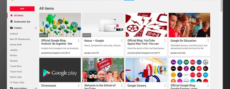
As you can see, cards have replaced the simple text lines that previously showed your bookmarks. Also, these new cards take up a much more page real estate than the lines or as Dilraj Singh says in BetaNews, "If you have a lot of (junk) bookmarks, it is probably in your best interest to organize/delete them before you switch over to the extention, as each bookmark will take a lot more space, and scrolling through them will be a pain."
This extension will completely override the old system if you download it, so be certain that you want to do this. You can sync up all of your various devices and it will add images and captions to your existing bookmarks. However, be wary. As one reader responded to Patrick Allan's story in Lifehacker, "But can you selectively sync bookmarks on chrome (sic) yet? Really need that feature. Don't mind if they all hit the cloud, but some of my home bookmarks are a bit too racy to sync at work."
This leads into another feature, sharing. By using a link, your folders are able to be made public so that by using a link, you can share with others. So before you share any folders, you may need to clean it out or reorganize to avoid "racy" or just irrelevant sharing.
Additionally, it will automatically organize any your bookmarks by topic, including your existing ones (you can reorganize just as you do now), but will leave your current folders in place and enable a Google Search of them by title, snippet and content.
I have no plans to add this extension as I have not been too excited by the large cards since I have a quite extensive bookmark collection and don't want to have to go through that "pain" to view my bookmarks. I also fear that I might make a folder public inadvertently. If I want to share, I have Google+ and/or this blog.
Formerly leaked as "Stars", Bookmark Manager is available here.
Monday, October 27, 2014
Apple Pay Vs. Retailers: Who Will Control the Data?
Apple Pay is causing quite a ripple throughout the retail and marketing world. On one side are the tech people trying to create a dominant feature for their market, the mobile user; on the other is the retailers who want to collect and control data on their customers.
Some are seeing this as a fight over mere tech processes, but it is really a fight over consumer data because those who control the data have the power.
Retailers will have an uphill battle against customers who will want to use a tech that has no real data benefits for the businesses versus forcing those customers to use yet another system that may provide actual extra savings to those customers and loads of rich data to the retailers
Sunday, October 26, 2014
Inbox Will Out Before It Is In
Google recently introduced a new app called Inbox which does for your Gmail what Google Now does for your mobile device. I am unlikely to try since my emails are directed elsewhere and are quite mundane, lacking in airline trips and multiple business and family appointments.
It appears to be a combination of the Google Now cards and the multi-tabs that Gmail already has in place. I turned off those tabs long ago.
Mike Elgan of Computerworld thinks that not only will all of us be turning off our Gmail multi-tabs, but the whole Gmail system. I don't see that happening, even in the time frame he predicts. I think that Inbox will eventually be absorbed into Gmail as just another function or simply remain an app that works with it.
He sites Google's desire to personalize all of their services,but I think that he left out one key component: the users. Like myself, most people do not have enough busy-ness to really need the kind of parsing and dicing that Google Now can do.
Certainly, people have appointments and notices and bills and such coming to their inboxes, but much is of the read and file/delete sort if not just "junk" mail. I think that this new app is going to saturate its market fairly quickly and the rest of us will survive perfectly well without it.
This will be what Google will learn as time passes and adoption slows and stagnates. People don't want different (ask Facebook about Paper for answer about different). This is why I believe that Google, at the most, will try to force it on Gmail users only to be rebuffed for its efforts and be forced to allow Inbox to be an option, not the default.
This happened with the tabs that Gmail introduced, with the forced Google+ membership and with the YouTube/Google+ intregration. Unlike Facebook (and Twiiter and it "recommended" tweets), Google does listen and modify it system, even if it takes a bit of time.
Mark Traphagen recently speculated that Google ended ended its Authorship program "was [that] the adoption rate was very low. That means that Google was working with an incomplete signal." (quote from the summary of the interview, not a direct quote).
So I see Inbox as yet another experiment that will hang around for a while and then get placed on the back burner waiting for the gas to be turned off.
Subscribe to:
Posts (Atom)