And what a horrible format it is.
Your Home page now is divided in to two choices: communities and people. If you have not previously added any, they suggest some of each (and if you have read any of my older posts here, you know exactly how I feel about these kind of "recommendations").
As I actually use this service on a semi-regular basis, only half of the suggested communities were entirely irrelevant. But the others weren't much better. While I have read specific articles from those publishers, I only view their sites via Google News filters and then only if the story interests me.
The people were absolutely no one I had ever heard of before now and will never hear about again.
To find your comments, you must then click on your unlabeled avatar. Next to that is the unlabeled replies and notifications button (moving your cursor over the avatar reveals a hidden label, "Me" while gray or red word bubble reveals "Replies & Notifications". I had to read a guide to the new layout to find them).
Upon reaching your "Profile" page, you will find three buttons: Recent Activity, Comments and Favorites. I don't "favorite" any comments, so they and your comments will be intermixed. But comments are displayed in a new card format that looks like Google's Now cards. Your comment/s on the left and a large image (if available) on the right. Longer comments will be collapsed with a "more" button beneath. The articles are listed in order of most recent comment made. So if you made multiple comments/replies over several days, the most recent brings it up on your list. This is because all of your comments/replies are grouped together on the same card. Replies appear without the original comments that you replied to, just your out-of-context replies stacked on top of each other.
You will find those comments when you click through the Replies & Notifications button. Two buttons are shown, Most Recent and Replies. Most Recent shows only the first line of your comment with a button to "View Comment". This column also shows upvotes (and presumably downvotes) with the user (or guest) and an up pointing carat. These can be hidden by clicking on the gear on the left and checking the "Hide upvotes" box. Replies have a right pointing arrow and are also collapsed with a "more" button if lengthy.
On all pages, to the left of your avatar/replies etc. buttons are a nine-dotted square and a gear. The gear is your usual settings. the square is a "Discover" button for finding "Channels" and topics (publishers that use Disqus).
The Channel buttons did not work, but the topics take you to what is essentially an aggregate of articles/posts that fall under that topic listed in reverse time order (newest at the top). I frankly don't care if Disqus is used for the comments or not. I comment wherever it is easy to create an account.
Disqus allows you to create a profile, anonymous if you want, with few steps involved (or so it was when I joined; they may have one of those mandatory "choose to follow" style set-ups now). Once you have a profile, it is easy to comment by simply clicking on the login button and choosing Disqus. Your posting name will appear in the gray box and you can begin you comments.
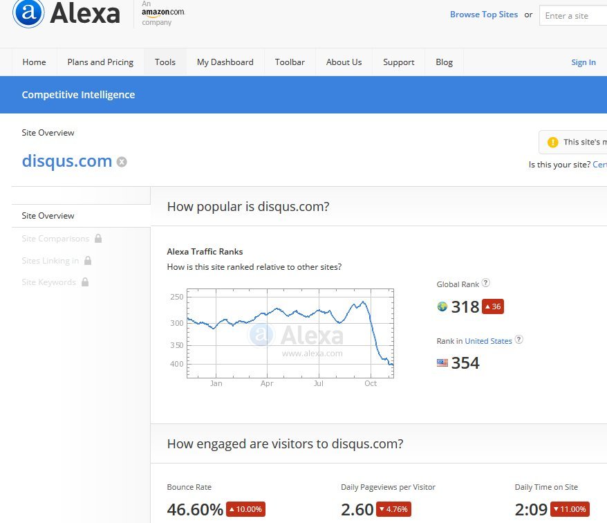
I like Disqus, but this new layout is poorly done, though attractive. But pretty does mean useful. Since the earlier update in July, the Alexa ranking was increasing until a peak in September and has now dropped of considerably.
If the feedback on the "Discuss Disqus" channel is any indication, it may continue to drop even more just as they are starting introduce programatic "Sponsored Comments". "This is disappointing and disheartening, especially since my plan is to use comments as a means to connect and build relationships. Now there will be sponsored ads in the comment section–ugh." This comment was later deleted from the blog posting. Allvoices is skeptical about these ads while Adweek at least notes that they use Disqus for their commenting section. Businesswire simply post their press release.
I use adblockers, so I have no fear of these intrusive commercials. My greater concern is that this coupled with a disruptive and counter-intuitive site will cause users to flee what been (up to now) a really useful place to keep track of a lot of your comments without clogging up your email.
No comments:
Post a Comment